
Redesigning a School (Moodle)
Homepage for a Better UX/UI Experience
As part of my role in the School of Electronic Engineering and Computer Science (EECS) at Queen Mary University of London, I led the redesign of the school’s QMplus homepage to improve clarity, navigation, and accessibility for students and staff.
The original layout was cluttered and difficult to navigate. I took the initiative to restructure the content, prioritise essential links, and introduce a clean, user-focused design that aligned with institutional branding.
The refreshed homepage has since been adopted as a model by other schools across the university.
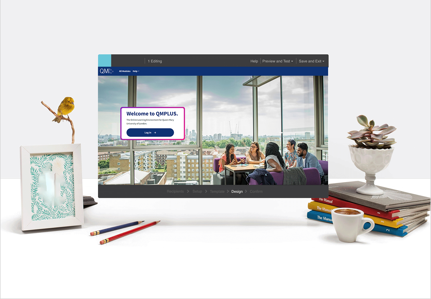

The Process
After reviewing the original homepage, I identified that the layout was difficult to navigate, visually uninviting, and overloaded with unstructured text. To address this, I restructured the page from the ground up — organising content into clear sections, introducing visual cues and tiles for quick access, and reducing cognitive load by replacing long blocks of text with concise, action-driven labels. My aim was to shift the page from a passive list of information to an intuitive, student-friendly starting point that supports both clarity and self-service.
So, what I did was to audit the existing layout and pinpointed areas of confusion. Then I restructured content into themed sections—such as Welcome, Support, and Exams—using clean tiles and headings. I enhanced visual hierarchy by adding banners and colours, improved accessibility with clear links, and ensured everything aligned with the School’s brand.

